Article by Clint Streeter, GIS mapping specialist
June 2018
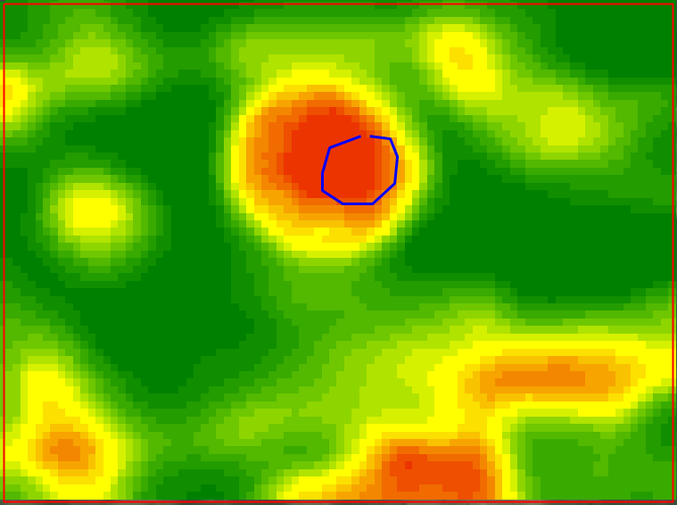
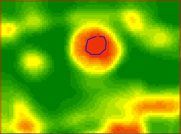
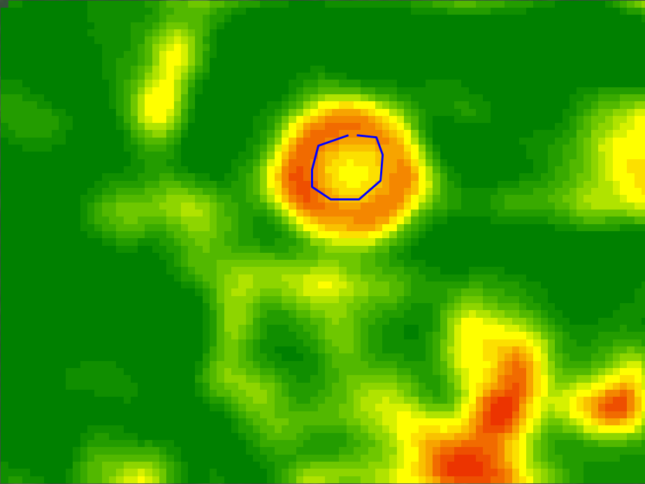
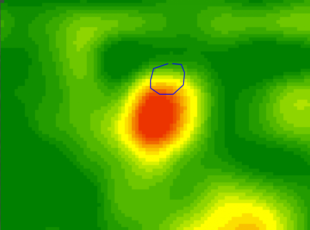
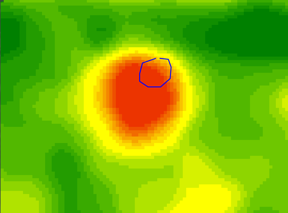
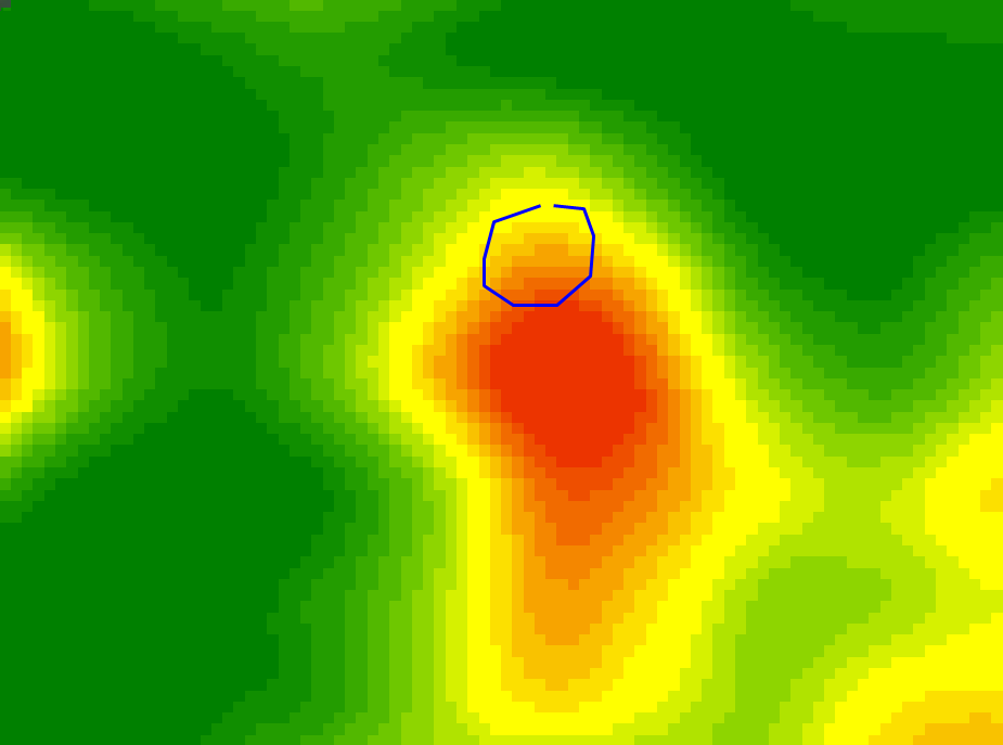
Detail or variability is an important part of creating zones in my opinion, but it doesn’t do any good if it isn’t spatially accurate. Anyone who has used the image alignment arrows when cutting out imagery in ADMS knows what I am getting at. In the management zone creation process there are many different factors that contribute to the accuracy of the zones and how well they represent the field. One factor that I think is commonly overlooked is imagery alignment. If the georeferencing accuracy of the images we use to extract our NDVI rasters from was always 100% this wouldn’t be an issue. Unfortunately, this isn’t the case. Images are commonly off by 30 meters (~60 feet) or more in both North/South & East/West directions in Landsat images and are rarely aligned within an acceptable distance. Sentinel and NAIP images can be geo-referenced much more accurately due to their higher resolution but can still be off enough to make a difference with NAIP images typically 2010 or older tending to be less accurate than the newer years.
One of the problems with misaligned images is that when they get merged together it can make normally small features into much bigger ones. This ultimately exaggerates features in a map, both increasing and decreasing map values in certain areas. Fortunately, there are a few things that we can do to in the management zone creation process that will help minimize this issue.
Guidelines
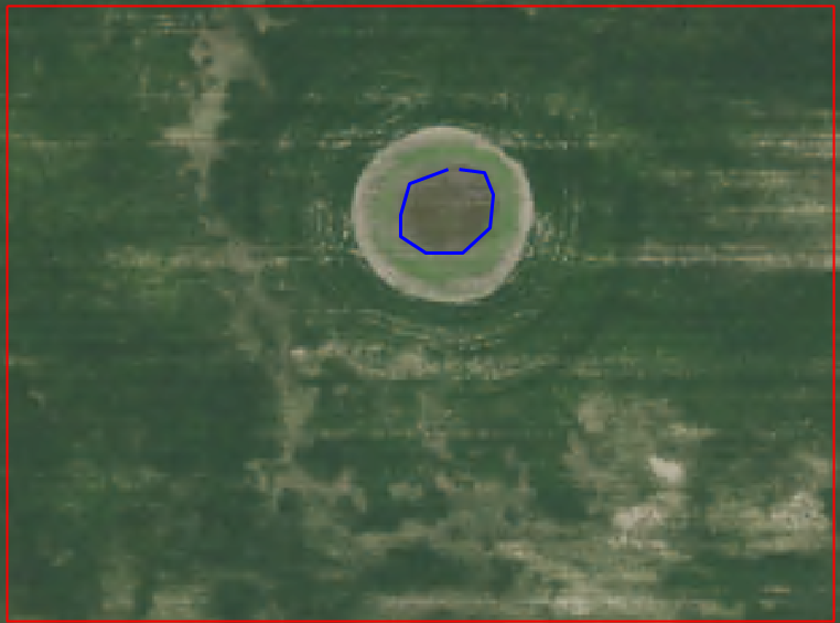
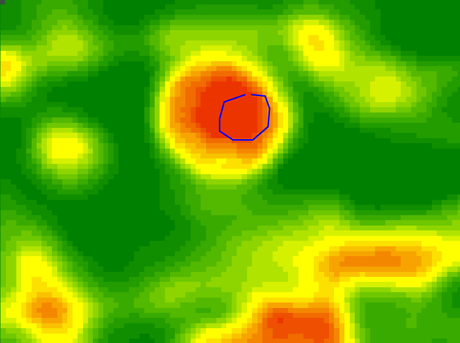
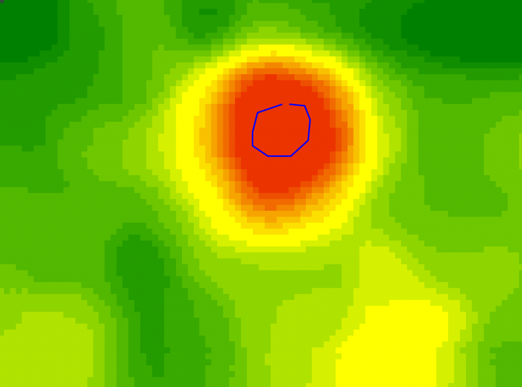
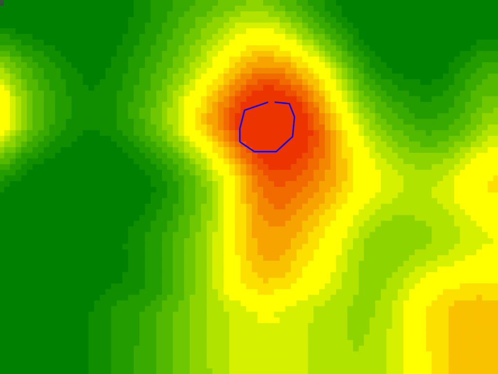
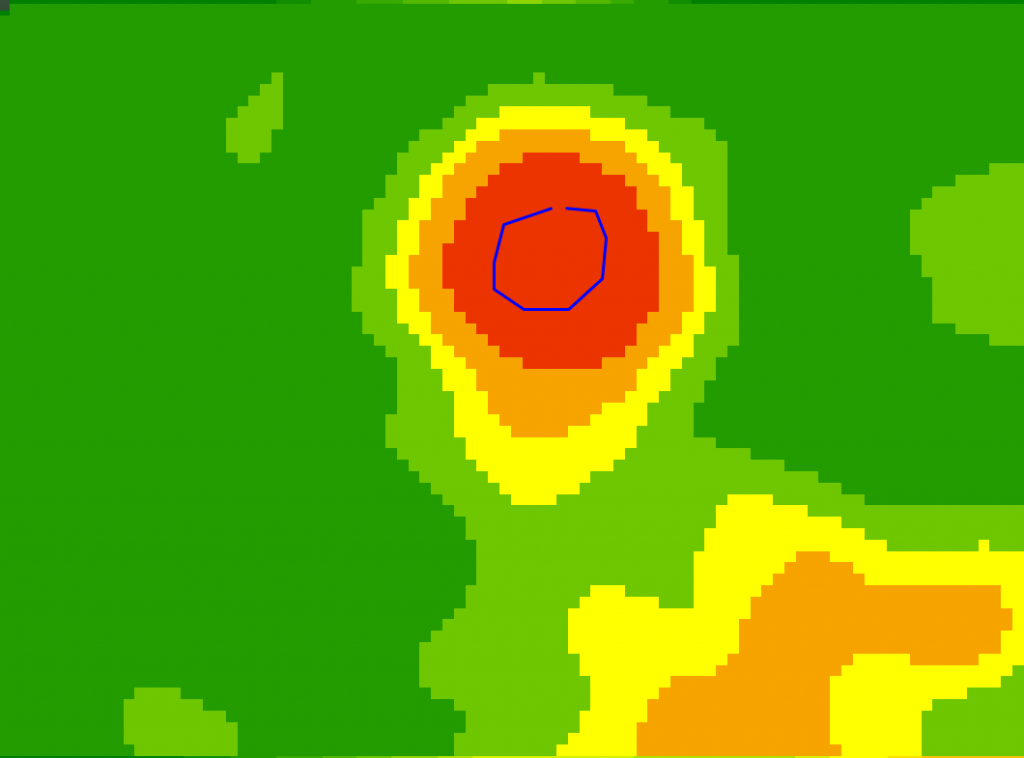
Having a reference to judge whether an image is aligned while extracting rasters can be very useful. Using a shapefile to draw features that can be seen in the images as you are viewing, evaluating and extracting works very well. The image alignment arrows then allow you to move the images to the appropriate location.
A drawn circle over a typically wet area can be used as a reference to align a common area in images.
Contours
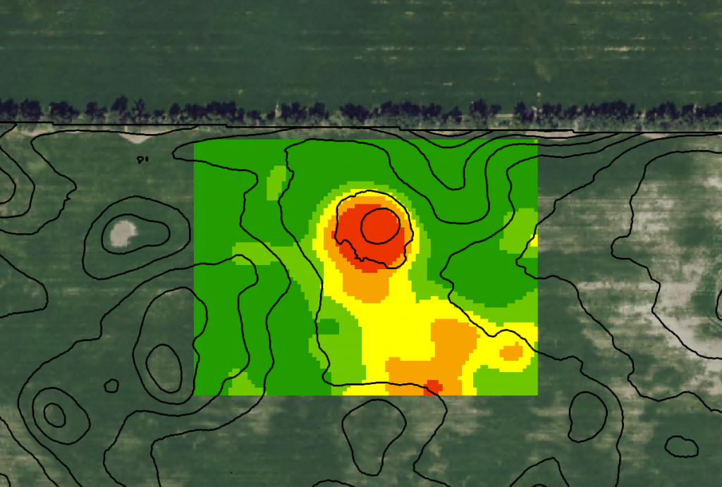
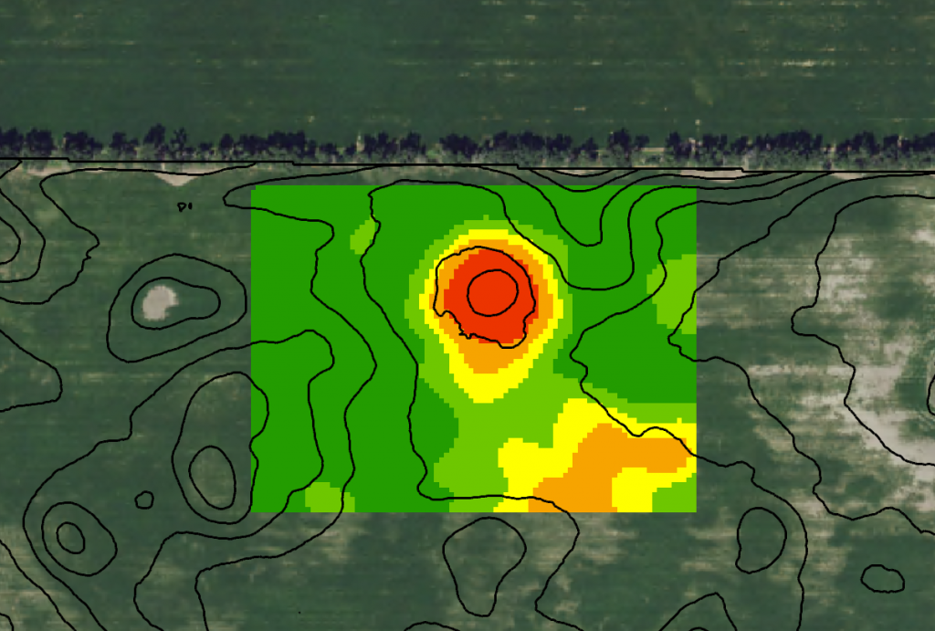
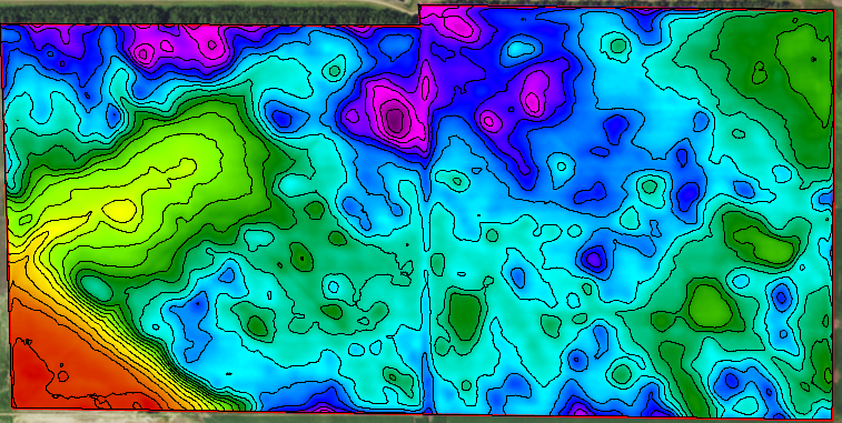
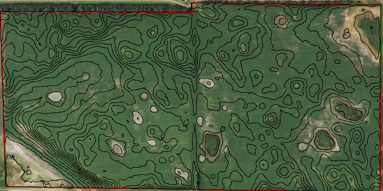
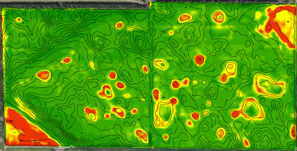
Another tool that I have recently started to use for aligning images (thanks to Kelly Sharpe) is elevation contour lines created from topography data such as LiDAR. It goes beyond what a few guidelines can do and gives you much more information about “transition” areas like hillsides as well as the hilltops and low areas. On top of giving you even more detail to align images with, contours also back up your logic as to why you think a certain image is a “good” representation of the field and ultimately one you would like to include as an input image for the merging process.
Adjustment Methods
Ideally, image alignment would take place during the extraction process. This doesn’t always happen due to not having a guideline to reference or simply not getting the image aligned the way you wanted. When evaluating rasters to decide whether you want to include them in your merge to create the final zones is normally when you realize that an image is not aligned the way you’d like it. There are two ways to correct this. One is to re-extract the same image over and try to get it lined up better before extracting it and the other is to adjust the existing raster. Adjusting existing rasters can be done by using

the Surface Properties tool in the bottom toolbar. Using the adjustment arrows, you can
move the raster in any direction to get it better aligned. Keep in mind that using this method moves the entire image causing areas along the field boundary that have no data. If these areas are minimal, it is possible to use the Fill tool to expand the raster outward beyond the field boundary, which you would then clip the raster to. If these areas along the edges are too large to fill, since you are manually creating data by using the Fill tool after all, it would be better to go back and re-extract the raster and try to align it more accurately prior to extracting.
Extra Work Pays Off
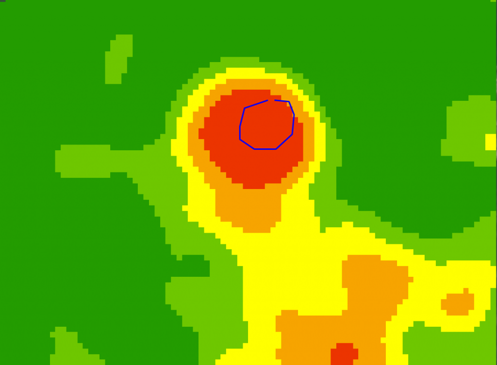
Once you get all your input images aligned and are satisfied with the images you have selected, you are then ready to merge them together. In the example below, I merged five images that are all misaligned to make the resulting 5 zone map shown with a Guideline and with elevation contours.
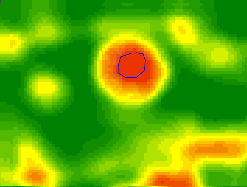
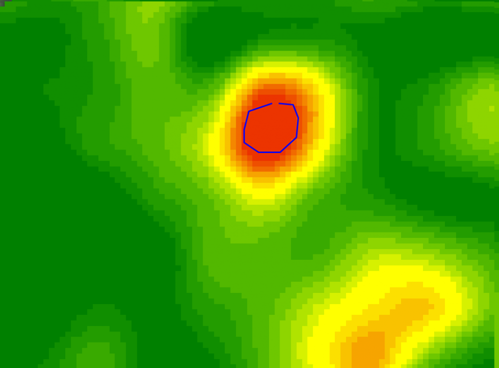
In the next example, I aligned the images first before merging the same five images together.
As you can tell from the images above, the aligned images created a much more isolated red zone and kept it in the proper location in the map. This is somewhat of a subtle difference, but in certain cases having your images aligned with each other before merging them together can make a huge difference. I’m sure many of you have heard the saying “Garbage in, garbage out” meaning the quality of product you get out is equal to the quality of products you put in. Talking the time to ensure you are using the most accurate data as inputs can make all the difference in creating a good set of management zones.

